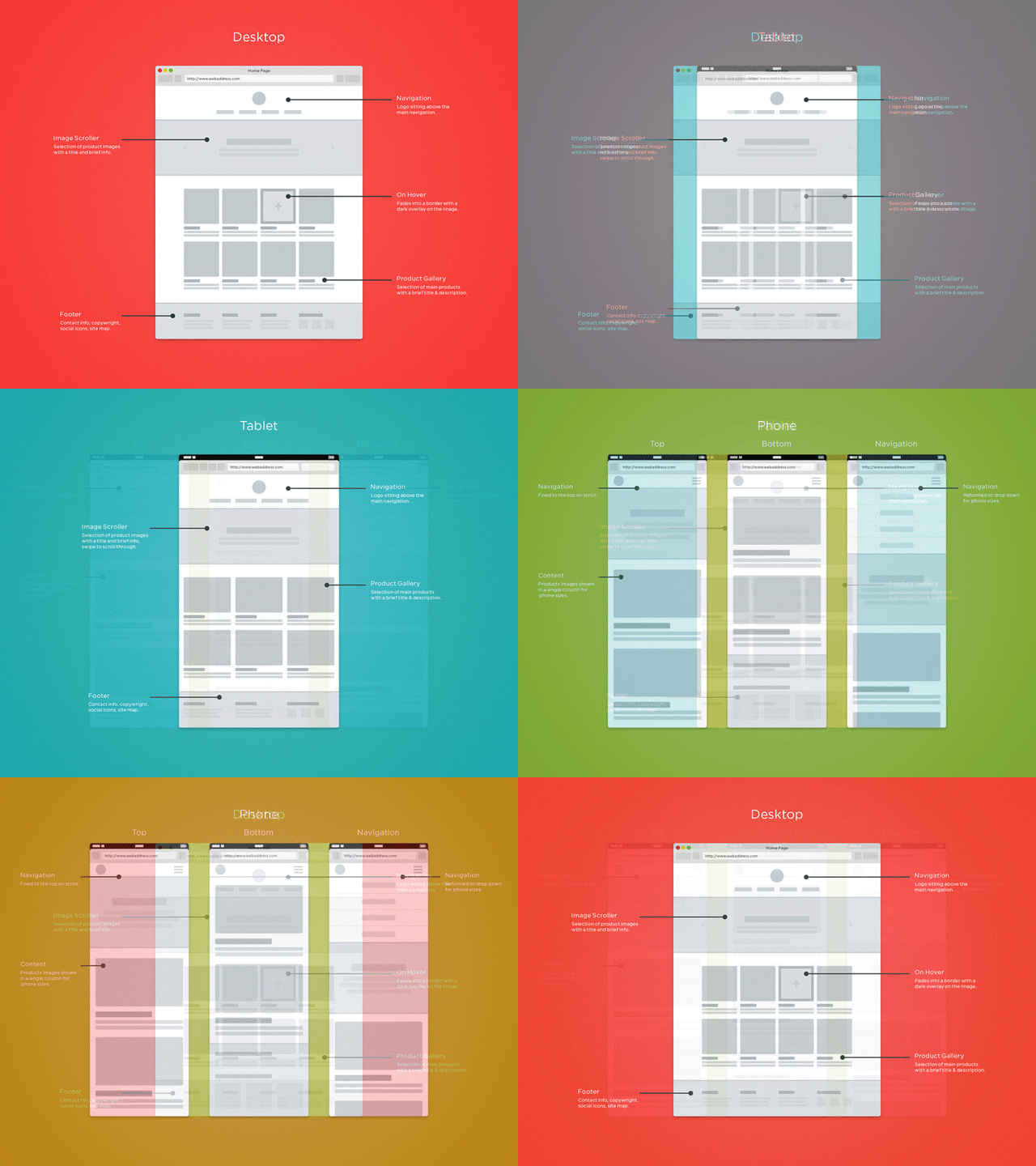
When designing a new website, it’s easy to get stuck on the aesthetics and overlook a critical part of your design: the user experience. The user experience (UX) is the ease and functionality that your website provides for its visitors, and it can directly affect your ability to make online sales. While these tips and tricks are a great launching point for your website redesign, it is always recommended to work with a digital agency to maximize your UX and website design.
1) Keep it simple
How your website looks and feels is important, but don’t forget that people are viewing your website to learn about (and possibly purchase) your products. Adding in design elements that don’t serve a purpose hinders the visitor’s ability to find the desired information or product.
By keeping your design and functionality simple and easy, you’re also making it simple and easy for visitors to explore your products. There are many ways you can help keep your website and navigation simple. Here are a few examples according to HubSpot:
- Colors. Don't use too many. The Handbook of Computer-Human Interaction recommends using a maximum of five (plus or minus two) different colors in your website's design.
- Typefaces. The typefaces you choose should be legible at the very least. And when it comes to colors, you shouldn't use too many. A common recommendation is to use a maximum of three different typefaces in a maximum of three different sizes.
- Graphics. Only use them if they'll help a user complete a task or perform a specific function (don't just add graphics willy-nilly).
- Strip away everything that doesn’t add value, then add some visual texture back in.
2) Prioritize your content
Closely tied to the principle of simplicity, visual hierarchy entails arranging and organizing website elements so that visitors naturally gravitate toward the most important content first.
Remember, when it comes to optimizing for usability and UX, the goal is to lead visitors to complete a desired action that still feels natural and enjoyable. By adjusting the position, color, or size of certain elements, you can structure your site in such a way that visitors will be drawn to those key elements first.
3) Navigation
Intuitive navigation can be critical for ensuring that visitors stay on your website longer, and can help secure them as customers. The more a visitor has to think about or guess where to find a piece of information or product, the more likely they are to try another website and leave your's. Here are some key navigation tips to consider:
- Keep navigation simple at both the top and bottom (specifically in the footer) of each page.
- Keep your main navigation bar consistent across all pages.
- Include a search box if applicable.
- Set up breadcrumbs (a navigational trail) so visitors can back track if needed.
4) Consistency
Consistency is key when it comes to user friendly websites. Themes, color schemes, font, and the voice of your company help users learn and identify with your company. Users can become familiar and comfortable with your brand and products through these consistencies. However, this does not mean each page should not have the exact same layout. Instead, feature complimentary layouts and consistent navigation throughout your website.
5) Credibility
Building trust can help improve your site's credibility around your brand and website. But where do you start? Start with what your company does, what you sell, and share the value with your users. Users should have easy access to learn about your company and company history. Always ask, why should they choose your company?
While it may seem counter intuitive, featuring a pricing page for your products and services can help your company seem more trustworthy. Legitimizing your company online can help you stand out against competitors and help users feel more comfortable making purchases on your website.
Conclusion
These tips and tricks may help guide you the next time you redesign your website, but it’s never too early to implement these changes and boost your user experience. Get started today by contacting our website experts at GemFind and receive $1,000 off custom website redesign!