If there is one thing most jewelry businesses have learned during the Covid-19 crisis is that having an online component to your business is extremely important. In a perfect world, it would have been nice if most jewelry stores already had this set-up prior to Covid-19, but as we are experiencing, that hasn't really been the case. If you are like most jewelers, the day-to-day has kept you so busy that you just haven't had the time to think about your online business thoroughly. We get it. If you are generating enough walk-in traffic and referrals, why jump into the unknown? A simple answer would be to diversify. But more so, consumer behavior continues to shift to an online mentality. Researching online before making a purchase is no longer a mystery as to how many consumers do it. In fact, almost all consumers research online prior to making a purchase.
The good news is that there are some things you can do with just a little effort that you can implement today to start generating more interest online and it's better late than never.
Effective Website with a Strong User Experience
First and foremost, your website is the hub where all business needs to take place. If your website is not set-up with a seamless shopping experience, you may be missing the boat. What is a seamless shopping experience? Think about how you like to shop. Would you buy from your own website if the tables were turned? What does your website tell you when you land on the site? Does it guide you to the right place in order to start shopping? Is it easy for consumers to ask questions and ultimately go through the checkout process?
If your answer is no to any of these, keep this thought in your mind: How can I reduce as much friction as possible in order to allow for business to happen on my site?
Here are a few key factors we'll dig into in order to make your website shopping experience seamless and reduce friction:
- Quick Loading Website
- Optimal Mobile Experience
- Well Merchandised Product Selection
- Quality Product Images
- Prominent Calls to Action
- Product Landing Pages
- Email Sign Up Offers
- Multiple Communication Channels
- Simple Checkout Process
- Abandoned Cart Emails
Quick Loading Website
Google's algorithm for ranking your website at the top of the search results is now affected by how quick your site loads, and for good reason. Consumers no longer have the patience to sit on their phone waiting for websites to load. If it takes longer than a few seconds most visitors will just leave and go to a website that is easier to use.
If you are curious as to how your site loads, visit Google's Page Speed Insights Here: https://developers.google.com/speed/pagespeed/insights/
If you are looking to start a new website because yours is not set-up properly, you should run some websites through the Google Page Speed Insights to see how they rank.
In our experience, one of the quickest loading platforms is Shopify as the platform itself is optimized for site speed, which includes a CDN for hosting images and a simple coding language, which makes it lightweight.
We've been able to optimize WordPress websites but if you're not working with an agency that specializes in site optimization and trying to do it yourself, it could be challenging. You need a quality hosting solution, set-up a CDN for hosting images, utilize full page caching, and more.
If you'd like some guidance on picking the right website platform, check out our friends at Jewelry E-comm's latest blog: https://jewelryecomm.com/2020/04/shopify-vs-wordpress-whats-better-for-jewelry-websites/
Optimal Mobile Experience
From 2012 to 2018, the total daily amount of time spend on a mobile device in the US by adults jumped from 88 minutes to 203 minutes a day.
By now, you probably know how important the mobile experience is for your website. If your mobile experience is something to be desired, it's absolutely essential that your site adapts ASAP. Otherwise, you might as well throw in the towel.
Well Merchandised Product Selection
Having a well thought-out product selection on your website is essential for user experience. I recommend not getting too caught up in the details though. Just get some products up and focus on quality vs. quantity.
You know your best sellers. Focus on those and forget about the temptations of having thousands of products available. There is no statistic that says having a huge product selection improves conversion rates. Focus on what you do best and make it easier on everyone, including your staff who will be fielding questions about products. The simpler the product offering, the quicker the buying process will be.
Quality Product Images
Since you may have more time on your hands during the lock-downs, now is a better time than ever to figure out how to get quality images for your products.
With cameras on smartphones like the iPhone 11 and the Google Pixel taking such amazing high quality images, paired with new tools like GemLightbox, it's not as complicated as it used to be. Make a small investment now in order to set you up for the long term.
Make it quick and simple so you can start selling. If you feel your picture quality is not adequate, find a photo editor on Fiverr.
Prominent Calls-to-Action
Calls-to-action are essential and one of the most overlooked components on jewelry store's websites that I come across. I don't know how many times I analyze a jewelry stores website and I can't figure out where to go once I land on the site. Many times, I can't even find where to get in touch with the business.
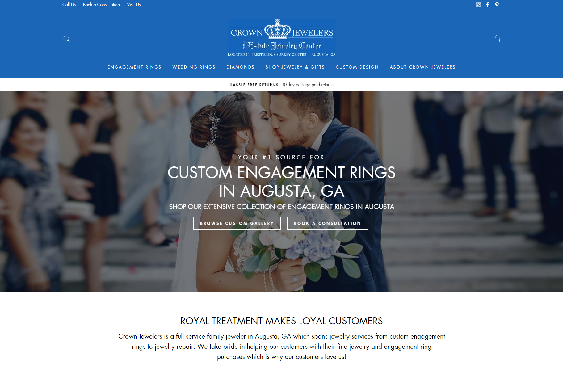
When a visitor lands on your website, they should know immediately where you are instructing them to go. See example below:

Immediately, the website tells us in the main hero area to Browse for Custom Engagement Rings or to Book a Consultation. Now a consumer knows what your main specialty is and when they are ready, they should expect to book an appointment.
Additionally, there is an option to call the store, book a consultation or visit the store in the header.
Product Landing Pages

Product Landing Pages are a key component to the overall sales funnel, but are often overlooked because of wanting a quick sale, instead of spending time thinking about the buyer's journey of your ideal customers. To be frank, probably only about 10% of shoppers are in the position to purchase. The other 90% is somewhere in between the research phase and the consideration phases of their journey. It is important to help guide users on their purchase and landing pages are the answer to providing that guidance. Additionally, landing pages can help users have a jumping off point on the category that makes the most sense for them after a little bit of learning.
Finally, landing pages provide the opportunity to highlight a focus keyword in order to yield optimal Search Engine Placement as well as high quality scores on Google Ads Campaigns.
Not sure what a good landing page experience looks like, check out Mervis Diamonds' Engagement Rings Landing Page.
Email Sign Up Offers
When selling online, it is important to collect email addresses as much as possible so you can start email nurturing campaigns as well as use for re-marketing on Facebook and Instagram. By having a visitors email address, it allows you to deliver ads to them as well as create lookalike audiences of users that have similar browsing and buying patterns as the email addresses in your list. Even though you may need to offer a discount, those email addresses can be extremely valuable for you.
Multiple Communication Channels
Reducing friction means doing everything in your power to convert a website visitor into a customer. One of the most important components to the entire online experience that we see being overlooked often is by having multiple forms of communication available and making it easy to find throughout the website.
Here are some of the forms of communication in the form of calls-to-action that we recommend to incorporate:
- Call Us
- Live Chat
- Text Us (Any texting service)
- Book an Appointment (Calendly)
- Book a Virtual Appointment (Calendly + Zoom)
- Inquire About this Item (Inquiry Form on a product page)
- Customize It (On a product page > Appointment)
- Email Us
Simple Checkout Process
Once a visitor is ready to make a purchase online or through the phone, it is important to make that process as simple and intuitive as possible.
A no-distraction checkout is a process that has proven to be very effective, which means the header and the footer disappears from the site so the buyer can just focus on what is most important instead of getting distracted and jumping around more.
If a customer wants to make a purchase off-site, Podium now has the ability to allow customers to pay via text message. This could help significantly with the off-line purchases.
Abandoned Cart Emails
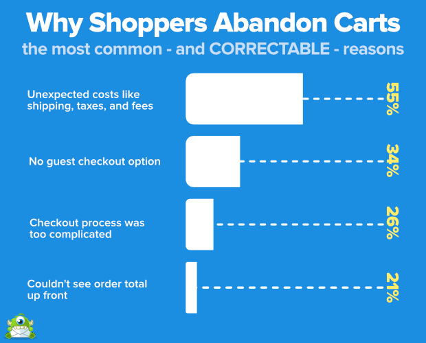
If a buyer adds items to their shopping cart but doesn't complete the buying process, it's usually because they want to see the total with shipping and taxes. However, this means that the buyer is at the end of their buyer's journey, but they just need an extra nudge. By adding abandoned cart emails to, it reminds the buyer to finish their purchase and can increase the odds of their purchase significantly.
Some statistics to consider:
- More than 40% of cart abandonment emails are opened
- 50% of these are clicked on
- 50% of the users who clicked purchased
- Half of the recipients who engaged with the content of the email completed their purchase.
- Why Shoppers Abandon Carts:

(Image courtesy of Optinmonster.com)
Essential Digital Marketing Tactics
Now that you have some ideas on how to make your site optimized, our next blog will highlight a few of the most essential digital marketing tactics in order to generate online interest. Of course it's not a one-size-fits-all approach, but there is a common thread among most jewelry stores and we are seeing some jewelers still generating a significant amount of business even during the safer-at-home orders in place. We have jewelers generating a lot of interest from Google Ads, Email Marketing, Active Instagram Stories, and more.
In Closing
Didn't we say it was simple? We know that we have covered a lot, but we suggest not getting caught up in the details. Just start with a few of the items that you find most do-able for you now. The most important part is just making progress for shifting your business online. As long as you are motivated to move in this direction, you will get there. If you feel this is just too much to handle, find an agency that resonates with you that will help set you up. GemFind has been helping the jewelry industry for over 20 years with digital solutions and we are happy to help you and have some great incentives in place to do our part in flattening the curve for jewelry stores. Contact us here to book a consultation.
Webinar
If you like what we've covered here, don't miss our webinar taking place on Wednesday, April 22nd where we will talk through these points and welcome industry leaders to give their input.
Register Here: https://gemfind.com/how-to-position-your-jewelry-business-online