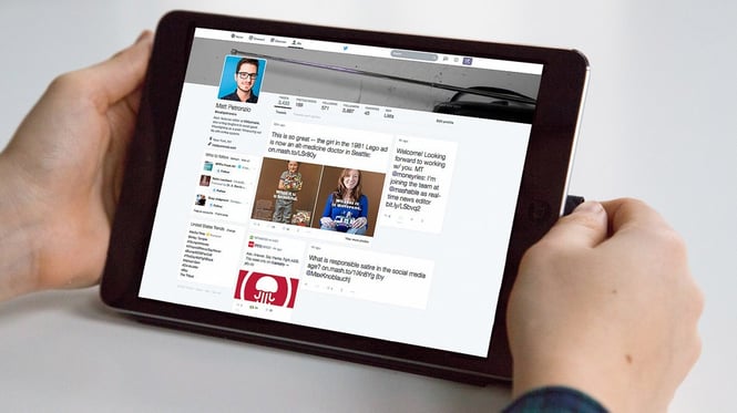
In an effort to boost user engagement as growth has been slowing, Twitter launched a major profile design overhaul that makes the site much closer to the likes of Facebook and Google+.
Twitter currently has 241 million users compared with Facebook’s 1.2 billion. The changes are part of an effort to make the site easier to use, favoring popular content and images over chronological order.
Users will find their profile image and short bio scaled to the left of their page with an increased header photo in the main pane. Twitter continues to emphasize photos on the site. The new design adds an emphasis on photos and content cards.
In possibly the most visible change of all, the new design abandons the strictly vertical timeline as it adopts a multi-column view that resembles the layout of Google+.
Typically only verified profiles displayed "Tweets" and "Tweets and replies" for users. With the new design, these features are available to all users.
The new design features a significant increase in the header size from 1252 x 626 to 1500 x 500 pixels, forcing users to change their images to avoid a stretched look.
Users with accounts using the new design will see other Twitter pages with the design changes, even if those other users don't yet have the feature. The network typically tests new features with a small, randomly-selected group of users before releasing to all users.
Twitter reports it is still testing and modifying the new design.
Connect with GemFind:
GemFind on Facebook . GemFind on Twitter . Gemfind on Pinterest . Gemfind on Google+
